Gallery Info Shop Blog Image Map

Monday, December 28, 2009

Step (through) the Looking Glass...

...and you shall find two deranged, eccentric creepers having a grand time messing around... Two hours of art was just the right amount of time before her departure to Washington D.C. and NYC the following day for the holidays.  Sophia is one of the most compassionate, free-spirited individuals I've ever encountered in my life.  Just her presence alone will summon the most profound sense of elation.  Her artistic inclinations are equally as beautiful:

Sophia felting acorns as small Christmas trinkets and pins for friends.

The finished product:

...and different painting watercolor cards for all of the wonderful people in her life. 


For Sophia: I didn't come equipped with any drawing/painting utensils...so I asked for her sketchbook and started doodling with a normal writing pen.  The first few lines formed a stop watch... For a couple of seconds, I felt uncertain what to draw afterward, but then it dawned on me that Sophia absolutely loves "Alice and Wonderland." 


As you've probably noticed, I was ultra-lame and somehow forgot to write "through" in the following phrase: "Step the looking glass." It's moments like these where I really question where my brain went.


STEP THROUGH THE LOOKING GLASS
Pen on paper 5" x 8" (2009)

Friday, December 25, 2009

Season's Greetings...

Happy Holidays everyone!  I hope you all enjoy a phenomenal Christmas with close friends and family.  May 2010 bring you many unexpected but pleasant surprises.


Here are the card designs for this year:


Keep your eyes posted on the mail... My apologies for sending these out a little late.  I underestimated how much time it would take to write separate, personalized messages to each individual. 


A special thanks goes to my talented friend, Andrea for this fantastic photoshoot--featuring none other than Snowball!

Wednesday, December 23, 2009

A perfect day...

I cannot even begin to express how grateful and fortunate I am to have such wonderful friends in my life!

Our idea of a perfect weekend indoors involved keeping things low-key.  We kick-started the afternoon by gathering together to spend some quality time conversing and cooking exquisite food!  Le menu du jour (all made from scratch):
PUMPKIN SOUP


Verene made the most divine pumpkin soup.  One sip from the bowl will send you craving for more.  It was absolutely heavenly.  What made her soup even more special was the conscious effort she placed towards natural food co-ops that support local farmers, community development and quality organic products.  Furthermore, she's a fellow vegetarian.  It doesn't get any better than that!

SESAME NOODLES


Here's my recipe for some tasty sesame noodles (inspired by Heidi Swanson's Otsu concoction.  She is my ultimate muse when it comes to cooking.  She's also quite the photographer). The convenient factor is that it's a quick and simple dish to make; almost effortless.

Ingredients:
  • 12 ounces of soba noodles, cooked and drained
  • 10 ounces of extra-firm tofu (for those who live in Seattle, I'd recommend buying them from Northwest Tofu Inc).
  • 4 to 6 green onions, thinly sliced
  • 1/2 cup of chopped cilantro
  • 1/4 cup of toasted sesame seeds
  • 2 tablespoons of sesame oil
  • Soy sauce
  1. Cook the soba in boiling, salted water until tender.  Then, drain the noodles.
  2. Cut the tofu into thin slices or small, bite-size cubes.  The extra-firm tofu I usually purchase from Northwest Tofu Inc. is already seasoned, grilled and coated with soy sauce.  To achieve this same effect, place half a teaspoon or less of olive oil into non-stick skillet set at medium heat. Place the tofu slices in the skillet and stir-fry until the pieces are brown on both side. You may even go the extra mile and add a little soy sauce.
  3. Combine all of the ingredients except for the sesame seeds in a large mixing bowl and toss until everything is evenly distributed .
  4.  Taste and adjust ingredients based upon your preferences.
  5. Garnish the dish by sprinkling the sesame seed on top.  You may even add chili sauce if you're a fan of spice.
Dessert: Verene's home-made chocolate chip mint cookies and fresh fruit tarts purchased from a Chinese pastry shop in the International District of Seattle!

    Disclaimer: The images above do not precisely depict the actual dishes...but they're VERY similar.  I had forgotten to take photos of our meal.  Special thanks to Sunshine Coast and The Pioneer Woman Cooks for the pictures shown above.

    We ended the day with a sketching session and a movie (with video games as the alternative option).


    Verene's sketch of an anonymous figure referenced online.  It's interesting to see how an individual's personality influences their artwork.  Verene happens to be a physics/math extraordinaire and her precise, sharp lines and attention to detail intrigues me.  I wish I could share a stunning portrait that she drew of an adorable Korean child...
    Verene's Sketch:


    Sometimes, images speak better than words, so I'll let Kelsey's incredible artistic skills do the talking. 

    Kelsey's sketch:


    Check out Kelsey's amazing concept art for Griptonite Games: kelsm.com 
    You may also follow his blog at: kelseymart.blogspot.com 
      
      That's all for now, folks!

    Sunday, December 13, 2009

    Soccer

    Soccer jersey concepts for DNV-GEC's soccer team. The team name is the #40's (it's an anemometer model manufactured by NRG Systems). Again, the main goal was to keep the designs simple. Limitations included using only one color (in which I somewhat failed by using blue and going monochrome).

    Flip through the catalog:


    FINAL SELECTION: "Caution Concept" - drawn digitally in Photoshop (October 2009).  The following design ended up as the final selection since it was later decided that the sports jerseys were going to orange. Thanks to the janitorial "Caution: Wet Floor" signs I encountered, this concept idea and slogan came into existence.  I found it pretty neat that these nylon-mesh tops were reversible (with white as the underlayer). This came in handy whenever the opposing team also sported orange jerseys...or unless you wanted to divide your team into two opposing groups for practicing purposes.


    THE RUNNER UP: "Global Soccer Design" - drawn digitally in Photoshop (October 2009).  I was trying to incorporate symbolic structural monuments and natural landscapes that represent Washington while simultaneously keeping soccer and wind energy as the primary components.  The globe was a plus since GEC stands for Global Energy Concepts.  Unfortunately, because it follows a monochromatic scheme, this design was too expensive to screen-print.


    Soccer team in action during a match in November 2009:


    Saturday, December 12, 2009

    Ultimate Frisbee

    Shirt concepts for my company's co-ed Ultimate Frisbee team.  It was suggested that I take a stab at this...which proved to be a difficult decision.  So far, I've managed to remain artistically incognito.  Accepting this offer would introduce exposure (which I completely despise and try to avoid unless persuaded otherwise).  Due to my horrible habit of perpetual procrastination, I spent only one night to complete these (as opposed to a week). Not good... The goal was to create simple designs; ones that would only require two print-screen colors (excluding the color of the t-shirt cloth).

    Flip through the catalog:


    The chosen design:


    DNV-GEC ULTIMATE FRISBEE TEE CONCEPT
    Drawn digitally in Photoshop and Illustrator (June 2009)


    Fellow Colleagues sporting the same tee after the Women Danskin Triathlon on August 16, 2009. Photo courtesy of Marina.

    Supplementary info: The wind farm depicted in the t-shirt designs are based upon Puget Sound Energy's Wild Horse Wind Farm in Ellensburg, WA.  Some of my colleagues and I received the opportunity to pay a visit to this location after observing a meteorological tower installation back in March 2008.  Photos courtesy of Raili.


    Saturday, November 28, 2009

    Lucia Black

    Concepts of Lucia Black, who randomly came into existence one day during my Natural Resource Management and Planning class.


    LUCIA BLACK (CONCEPT 1)
    Pen on notebook paper 6.5" x 8.75" (2006)

    Revisited this character a year later for further development...  I can already foresee her personality as mischievous, spontaneous, eccentric, witty and unconventional.  More updates to come later...


    LUCIA BLACK (CONCEPT 2)
    Micron pen on paper 8" x 10" (2007)


    LUCIA BLACK (CONCEPT 3)
    Micron pen on paper 8" x 10" (2007)

    Tuesday, November 24, 2009

    In transit...

    Having no other book to read but the final installment of Harry Potter during a flight from Vietnam to Australia shortly after its publication date can yield side effects.  For instance, when sitting through a long lecture in Sydney, no other doodles come to mind but the following:


    HAPPINESS WOULD COME...
    Pen on paper 8" x 5" (2007)

    Don't get me wrong.  The lecture was nothing short of boring and focused on nurturing parental acceptance and guidance towards children with autism.  If anything it was extremely insightful and interesting.  My mind just tends to multi-task and I find that doodling increases my engagement and focus.  I have to admit that questions raised by certain parents sparked some personal concern. Instead of inquiring more about meaningful or effective ways to support their child during moments of discrimination, hatred or condescension, they only seemed distressed about whether their child could reproduce! Anyhow, enough judgment for now.


    INTERTWINED ROOTS...
    Micron pen on cold pressed paper 8" x 11" (2007)

    Not much to say about this piece except that I was stuck at the Incheon International Airport in South Korea for 18 hours and I terribly missed trees. On a side note, I'm starting to really appreciate not carrying around a pencil at all.  If you mess up, then you mess up,  That's the pure joy of doodling without having to worry about the end product.  Art is a process rather than a product, and it's the challenge of stretching the limits of your imagination that is more rewarding. 

    Thursday, October 15, 2009

    Post-it notes make good drawing pads...

    Someone said the central figure reminded them of asparagus, which I found highly amusing. In tribute of this quirky remark, this quick doodle will henceforth be known as "Asparagus Girl."


    ASPARAGUS GIRL
    Pencil on paper 4.25" x 4.25" (2007)

    Sunday, October 11, 2009

    A Taste of Whimsy

    Prior to 2003, there hasn't been a moment where I've really let loose and personally trusted myself to let my imagination go wild. However, after some encouragement from a very close and special friend, Julie, I finally decided to take the plunge and IT FEELS SO LIBERATING! No references, no rulers, no nothing...


    (TITLE TO BE DETERMINED)
    Mechanical Pencil on Paper 11" x 14" (2006)
    It would be nice to revisit this piece in the future to further develop it. I imagine that this sanctuary would be nestled on top of a alpine mountain peak...with the sun rising beyond the horizon, the ocean sprawled out in the distance and clouds encompassing the bottom perimeter of the structure.

    Saturday, October 10, 2009

    Intertwined Dragons

    During a dreary, overcast day of confinement at a relative's house...with nothing but my notebook and college text books, I was left with little to do but...um...draw, I mean...study...


    INTERWINED DRAGONS
    Mechanical pencil on notebook paper 8.5" x 11" (2005)

    This original design was intially drawn as a shield concept for my beloved friend, Julie. It was revisited two years later when I woodburned the drawing onto keepsakes box for my (now) ex-boyfriend as a Christmas gift.

    Redrawing the design based upon the original (displayed above). The wooden box was premade and can be purchased at Michael's Crafts. If I had more time, I would've made one myself. Alas, spare time is a commodity I cannot easily waste nowadays.

    Still not quite finish redrawing the design...but almost there.


    Going over the lines with a woodburning pen (also purchased at Michaels). It is the same tool I used as a soldering iron during High School in order to melt metallic surfaces when creating stained glass pieces.


    For the interior, the intent was to create a mixed-media collage consisting of photos and objects that best reflect or symbolize the people, experiences, memories and interests that we found significant in life.

    A "nearly finished" snapshot of the interior before metallic trinkets and other objects were added to the collage. Three layers of varnish and glaze were used to coat the interior and exterior surfaces of the box for added protection against wear.

    Frontal view of the finished product.

    Frontal view of the finished product. The text has also been woodburned onto the surface. Sorry for censoring out the last three lines---they basically consisted of a personal message to the recipient that I suppose I don't necessarily mind sharing here. Oh well, too late.

    Japanese Obitsu Dolls

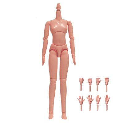
    I know, I know, dolls are beyond creepy (especially when you happen to stand in a room filled with them *shudders*). Even though I am generally not a fan of dolls, the process of doll-making triggered an insatiable urge to experiment. When I was 9 years old, I had sewed a couple fabric dolls and stuffed animals...but I had never worked with other mediums such as resin, plastic, etc. Hence, I decided to venture into the world of Japanese ball-joint dolls---simply because this type offered a wide range of flexibility in creating custom dolls. Most of the popular ones measure 60 inches in height and can range anywhere from $300 to the thousands. However, there is also the option of creating one...which is much cheaper. Unfortunately, not many people take this risk. Since the separate body components of the 60" dolls are ridiculously overpriced, I decided to go with the less-popular 21" body. I mainly found all of the neccesary doll parts on eBay for pretty reasonable deals. The body came preassumbled...but the head requires a considerable amount of rendering.


    The process was a little bit more time-consuming than I anticipated...mainly because the diameter of the head (where the circumferance is the largest) is equivalent to that of a quarter. For those who plan on working with resin anytime in the future, keep in mind that the material does not allow for easy cutting. All of my incisions were jagged because it was difficult to maneuver an exacto knife smoothly through the "rubber-like" texture. I needed to cut open the head in order to cut out eye slots and insert 6 mm eyes via super glue. I would have to say gluing in the eyelashes was probably the hardest part. They were so tiny, I could barely even get a firm grip on it to keep it in place before the glue dried. Eventually, I had to resort to a toothpick to achieve this task. Acrylic paint was used to define the facial details and glaze was added to the lips for a glossy look.


    Nothing strikes more horror than a head on a stick (which happens to be a pen in this case).
    Finished product (named Fuschia).
    Depicted below is Nadine (who shares the same body as Fuschia). The heads aren't supposed to be exchangeable, but I haven't secured them in place yet. Unlike Fuschia, Nadine's face does not require eye incisons of any sort. It was just a pre-molded component that required facial details to be painted on. I was stupid and did not draw anything out in advance (not even outlines of the eye shape) before whipping out my 1 mm diameter paintbrush and attempting to "wing it." As a consequence, I think the eyes may be slightly crooked...


    Finished product (named Nadine).